Dementia Friends

Dashboard Redesign for Dementia Volunteers

Company
Dementia Friends
Year
2018
Type
UX Research
The Dementia Friends Champions dashboard is online interface that Champions (volunteers) use to do certain tasks related to their role. Dementia Friends have seen a decrease in the number of Information Sessions that Champions are recording on the dashboard and an increase in technical enquiries.

The dashboard needs to be redesigned so that Champions can get their main tasks completed efficiently, keeping them engaged and increasing the number of Sessions they run.
intro-photo
About The Project

Duration

2 Weeks

Design Process

Double Diamond

Team

4 UX Designers

My Role
As one of the four UX designers on the team, my role mainly contributed to discover and define phase on this project.
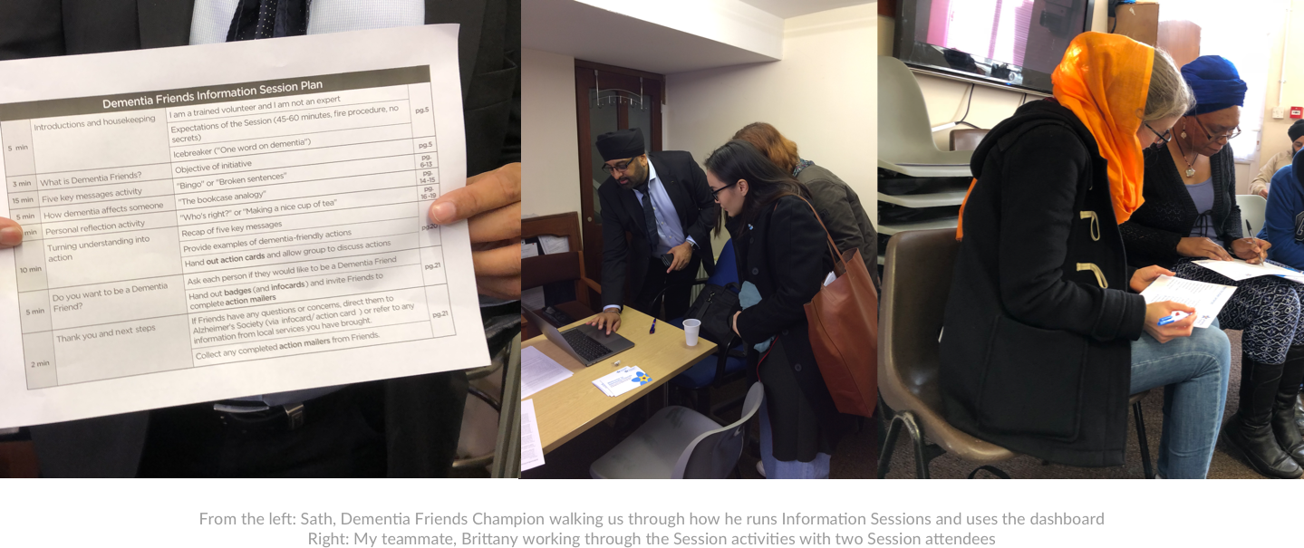
  • Field Research: conducting field research at an Information Session to observe and understand the dashboard’s context of use in real settings - pre-mid-post Information Session.
  • User Research: conducting 2 user interviews and 5 usability tests. Field visit to a Time Out event
  • Stakeholder interviews: with the management team and their developer to understand their expectations, development capability and technical feasibility.
Besides my main contributions, I also assisted my teammates in the design process by participating in the design studio with other stakeholders, designing functions for the dashboard, and ideating early stage prototypes from paper to mid-fi of dashboard homepage and mobile version.
Dementia Friends Champions are volunteers who deliver Information Sessions in their communities to help people learn more about dementia. Participants of the information sessions then become a ‘Dementia Friend’ as a result.

Brief

Goal: 2.6 million to 4 million by 2020
Dementia Friends is an initiative by Alzheimer’s Society to change the way people think, act and talk about dementia so that people affected by dementia are treated as equal members of society. Core to this are the face-to-face Dementia Friends Information Sessions, run by their volunteer Dementia Friends Champions. Since its launch, over 2.6 million people have become Dementia Friends, meaning they’ve learnt about how dementia affects a person and gone on to take action to help people affected by dementia. The initiative has an ambitious target of reaching 4 million Dementia Friends by 2020.
Dashboard’s context of use
The dashboard is Champions’ one-stop shop for everything they need to deliver inspiring Information Sessions in their communities and make real change for people affected by dementia. The charity has been using the dashboard as a tool to connect with their volunteers and to keep up with their progress. Volunteers use the dashboard to log the Sessions that they are running, tell the program how many Dementia Friends they’ve made, access all the resources they use to run their Sessions as well as many other functions.
The Challenge
However, Dementia Friends have seen a decrease in the number of Information Sessions that Champions are recording on the dashboard and an increase in technical enquiries. The dashboard needs to be redesigned so that Champions can get their main tasks completed efficiently, keeping them engaged and increasing the number of Sessions they run.
Dementia Friends gave us a prioritized list of the keys tasks that Champions perform on the dashboard. They also detailed that they wanted to focus on mobile for the redesign.

Empathizing Champions’ Experience

We started the research phase by immersing ourselves in the whole experience of being a Champion, attending an Information Session run by a Champion, and running a UX audit of the current site. Following this, we interviewed and conducted usability testing with 11 Champions, myself leading 2 of those. As well as delving into their experience as Champions and their use of the dashboard, it was also important for us to find out how experienced they were with using the dashboard itself - how many Sessions they’d run, how long they’d been a Champion for - to understand whether proficiency of use might be down to simply learning the dashboard over time.

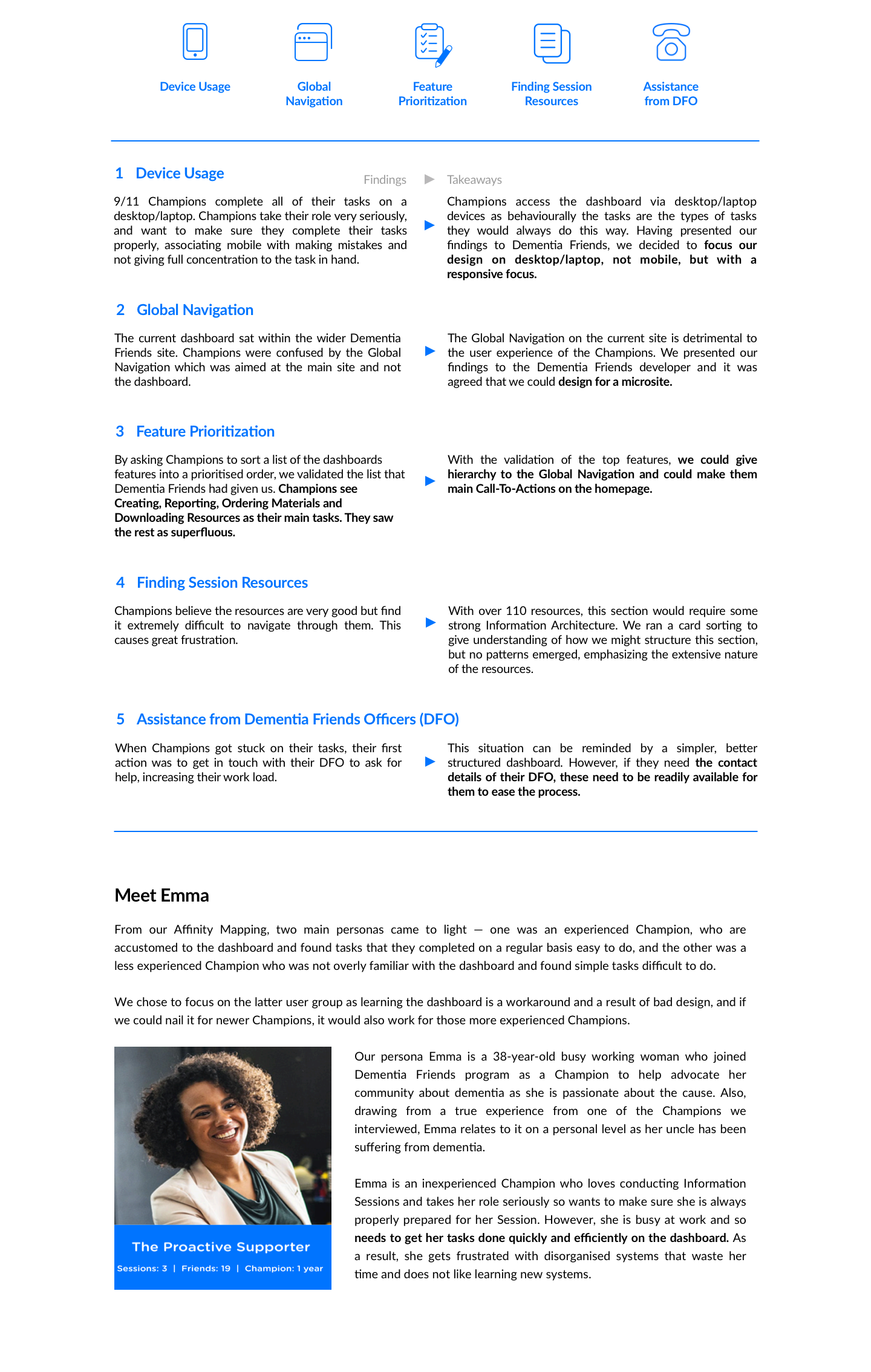
We used Affinity Mapping to synthesize our research and to help create common understanding.
We discovered 5 main insights:

Designing experience that meets Champions’ needs

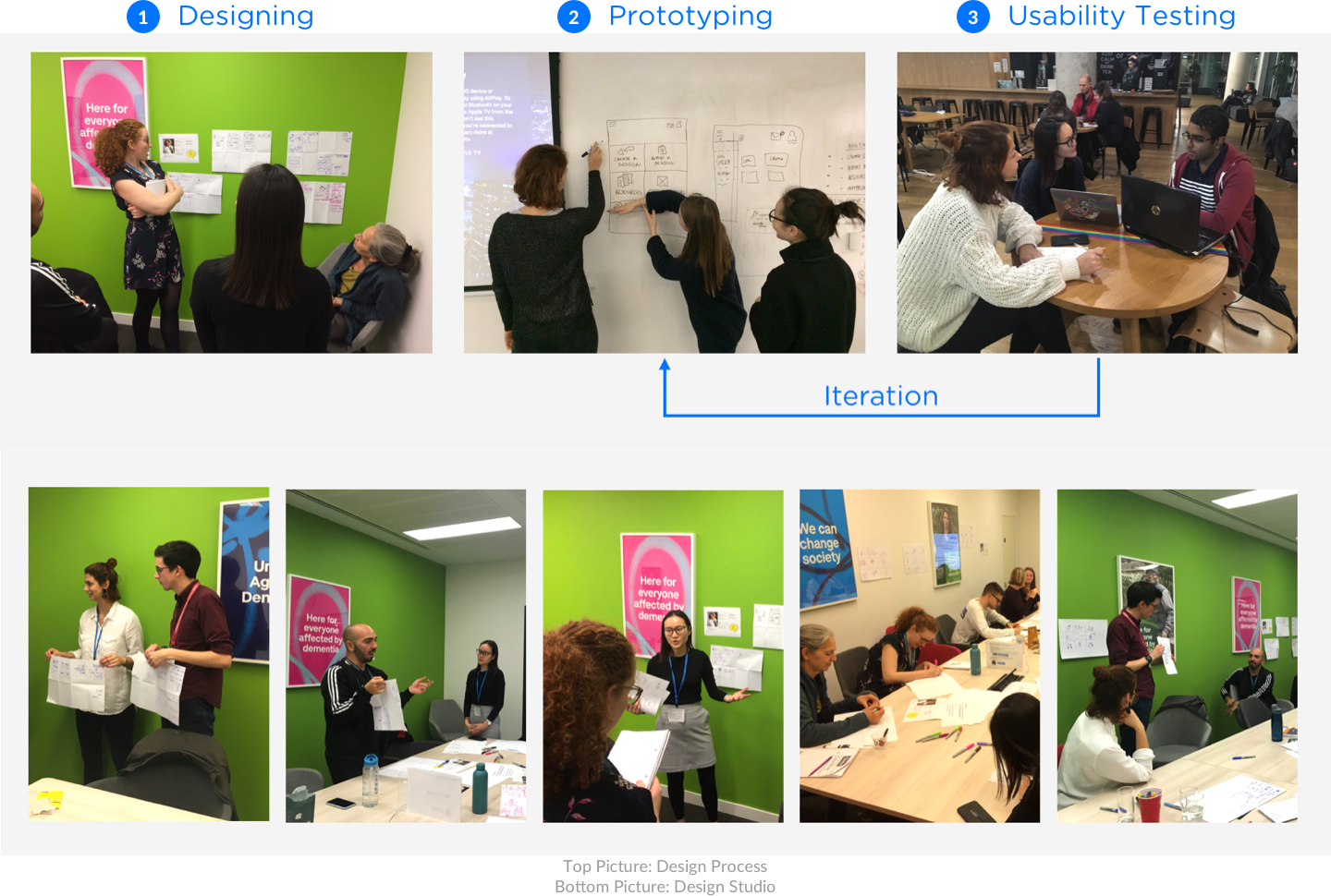
Before we jumped into designing the dashboard, it was important for us to brainstorm ideas with the people who were familiar with the work process better than us, we ran a design studio with the client and began with presenting our user research findings to get everybody aligned on the same page, warmed up the room with some exercises as majority of them have never attended a design studio session before, and described the opportunity for the design that the group was going to focus on using a How Might We statement:
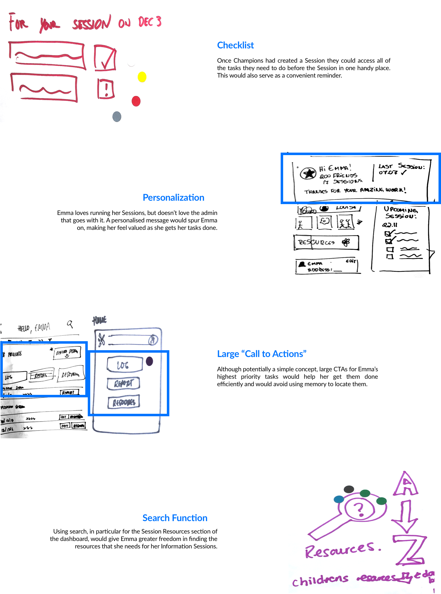
The following are some of the fantastic concepts that arose that we took away from the session:

Designing with Dementia in Mind

As we entered the main part of the design phase, we had to make sure we designed with Dementia in mind, as some Champions are living with Dementia themselves. From the Dementia Digital Design Guidelines/Heuristics, there one overarching key takeaway:
Iterate designs gradually and judiciously — if it’s working, keep it.
Don’t tinker with design necessarily. If it’s working, keep it. Keep in mind impaired memory and learnability. Where possible: refine, rather than wholly redesign.
Our research had shown that experienced Champions had learnt the dashboard rather than finding it easy to use. In light of the Heuristic above, this became a much starker reality and solidified the fact that we had to be judicious in our approach — processes that worked, we kept.
Rapid Prototyping

We quickly created a paper prototype which included the flows for the main tasks, testing with 5 users each time up to mock up level. When testing, we gave participants the main tasks to complete.

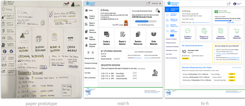
Homepage

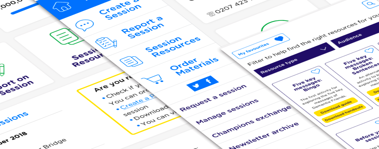
We focused on discoverability of the key tasks from the homepage. Users had no problems finding each of the tasks, with the majority using the large CTAs in the centre of the homepage. However, the checklist function was not readily noticed by users, so we had to work on this, giving it more real estate on the page, a more checklist like structure and bright colours to draw attention to it.
Prototypes' Photos

Resources

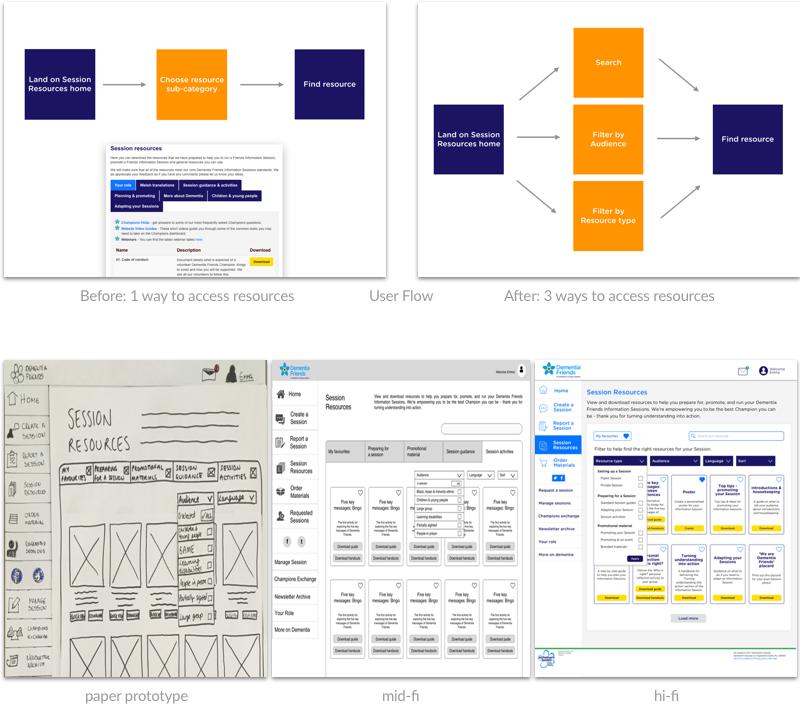
The current user flow on the dashboard seems simple (see image below), yet when conducting usability testing on the current site, we found that in reality users were dipping in and out of different sub categories to try and find the resources they were looking for.
User flow for the current Resources section Through our redesign of the Resources section, we wanted to give Emma as many ways as possible to find the same resource. In our final design, she would land on the Session resources homepage, have option of starting with a search, filtering by audience, or filtering by resource type, to find the same resource.
User flow for the new design of the Resources section Starting with an image of the resource to make the section more visual, we iterated to a card layout that would allow related resources to sit together. The search bar had to be made more prominent as users weren’t noticing it. Instead of the folder structure, we created a separate ‘Resources type’ filter for this to give Emma more flexibility and added a line of copy inviting Emma to use the filters as well as a strong, bold colour to guide them towards using them.
Prototypes' Photos

Report

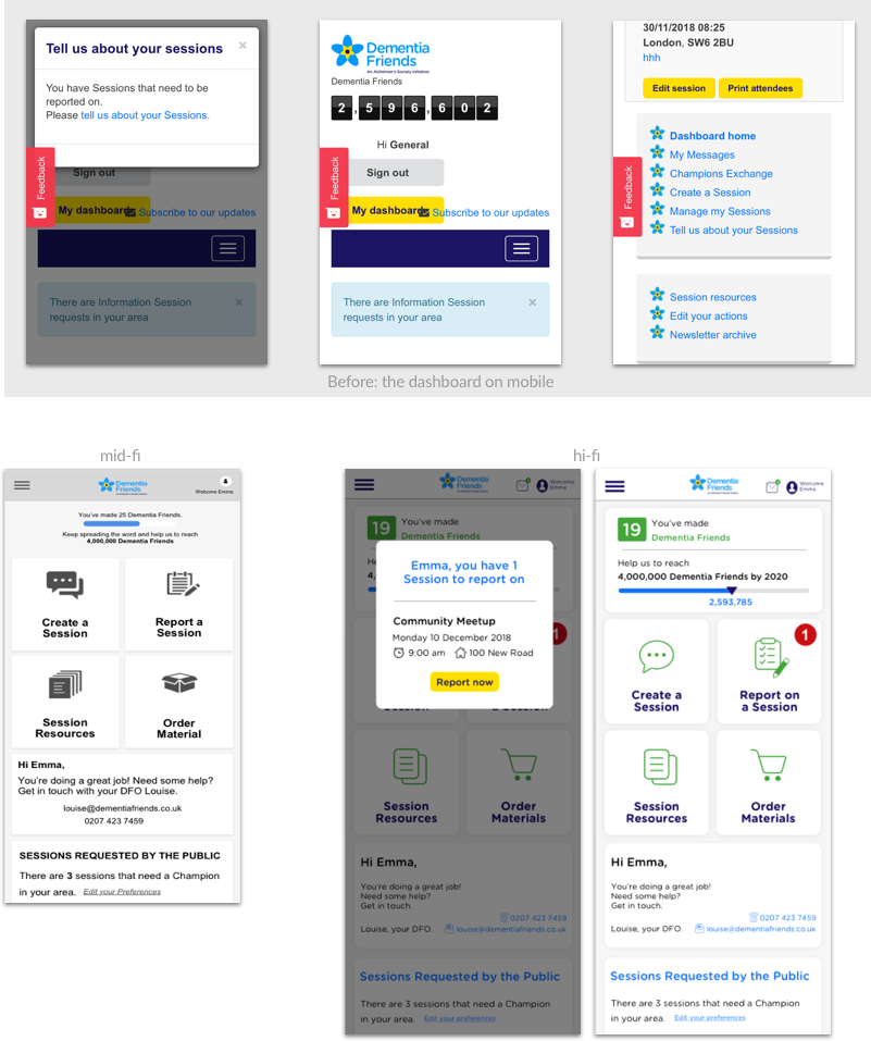
Reporting on a Session is something that is very important for Dementia Friends as a charity — without this they have no way of knowing how many Dementia Friends there are in total. For this flow, we chose to design the mobile screens as this was the task we found in our research that Champions would be most open to completing on mobile. Currently it is very difficult to find where to report on a Session.
Current user flow for Reporting on a Session In our design, we made ‘Report on a Session’ a clear CTA. After testing, we added the pop-up back in but gave it a clearer, more informative design. Failing that, when closed, there would also be a permanent red notification on the CTA as a reminder.
Prototypes' Photos
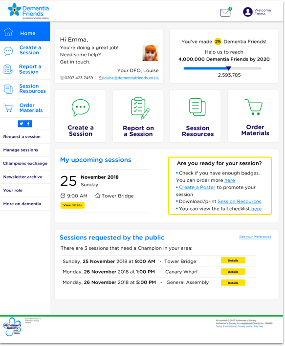
MockUp Photo
Final Prototype |
Our final prototype is built using InVision and can be found here.

Conclusion

How did we solve the problem?

Our design needed to improve discoverability and efficiency of key tasks for the Champions. We achieved this through a clean, simple dashboard using a card layout that would be easily responsive to tablet and mobile. Designing with dementia in mind, we kept processes that worked, and improved upon those that didn’t to enable volunteers to get their most important tasks done. With reduced friction, Champions will be more engaged and more likely to run more Sessions, whilst the Dementia Friends team can focus on other areas for growth.
Feedback from users

From the 2 personas that emerged from user research, we chose to design for newer Champions with the hypothesis that learning the dashboard is a workaround and a result of bad design and if we could nail it for newer Champions, it would also work for those more experienced Champions. After 5 usability tests on the final prototype with seasoned Champions, their positive feedback confirmed our hypothesis that if we could nail it for new Champions, the new dashboard would work for seasoned Champions as well.

“Very clear! The less is on the page, the easier to follow.”

“The main things I need are right there.”

“Nice, clear and easy to use. “
Feedback from client

“The redesign met and exceeded our expectations […] Every design decision that they made was backed up by evidence and informed by the feedback they received from our users. Their work resulted in an end product that we could take away and implement, confident in the knowledge that it would empower our volunteers to have even more of an impact.”
— Lucien Topp, Dementia Friends
← Time Out Magazine
READ OTHER PROJECTS